
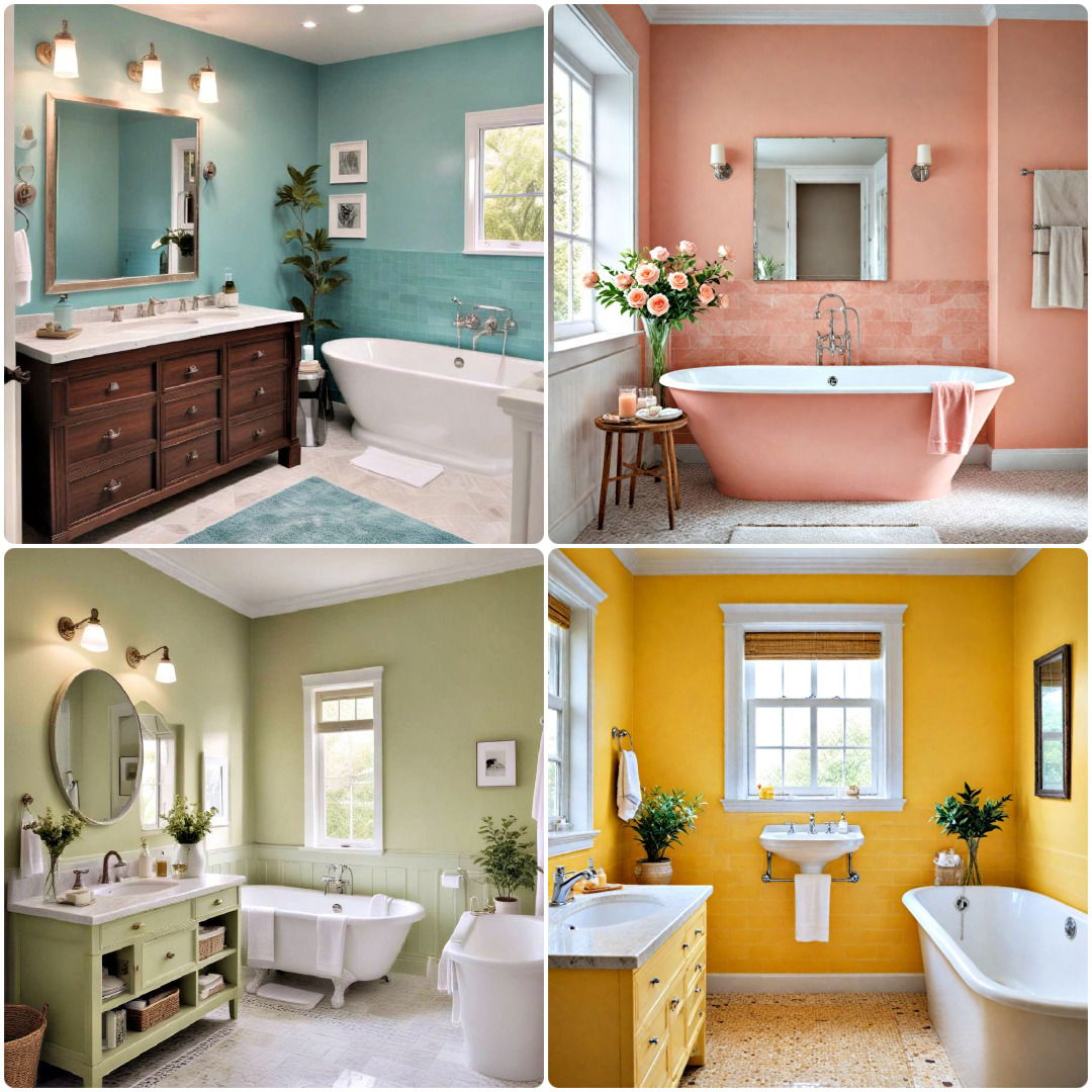
Mastering Bathroom Color Schemes: My 15+ Years of Practical Wisdom
After more than 15 years in home design, I’ve seen firsthand how a well-chosen bathroom color scheme can transform a space, making it feel like a personal sanctuary. It’s more than just picking pretty colors; it’s about crafting an atmosphere that reflects your style while standing the test of time. Let me share some hard-earned lessons that will help you avoid common pitfalls and create a truly cohesive and enduring look for your most private space.
The Foundation: Understanding Your Bathroom’s Core Elements
When clients first approach me about designing a bathroom color scheme, their eyes often immediately drift to paint swatches. While paint is a significant component, it’s rarely the starting point. My first piece of advice is always this: begin by assessing your fixed elements. These are the unchangeable or difficult-to-change components that already exist or are decided upon early in a renovation, such as your floor tiles, shower tiles, vanity countertop, and even the finish of your fixtures (chrome, brushed nickel, brass). Trying to force a color scheme that clashes with these foundational elements is a common beginner’s mistake and a recipe for frustration. For instance, I once had a client adamant about a cool, crisp grey and white palette, completely overlooking their existing warm beige travertine floor. The result was a visual disconnect where the new cool tones constantly fought against the underlying warmth of the floor. Had we acknowledged the travertine’s natural hue, we could have leaned into an earthy, spa-like scheme with soft greens or warm off-whites that would have felt harmonious and intentional.
Common Pitfalls and How to Avoid Them
Over my decades of experience, I’ve pinpointed several recurring mistakes that can derail an otherwise promising bathroom color scheme. Learning to anticipate and sidestep these pitfalls is key to a successful outcome.

One of the most frequent errors is what I call the “everything I like” approach. It’s tempting to want to incorporate every beautiful color you’ve ever seen into one space. I once had a client who loved vibrant aqua, sunny yellow, and deep coral. They tried to give equal prominence to all three in a small guest bathroom. The result was chaotic and visually overwhelming, making the space feel cramped rather than cheerful. My advice: choose one or two primary colors, then a single accent color. Let the primary colors define the large surfaces, and use the accent sparingly in towels or art. This focused approach also helps define the room’s emotional “feel”—are you going for a tranquil spa, a playful kids’ bath, or a sophisticated powder room? A clear purpose guides simpler, more effective color choices.
Another critical oversight is neglecting the impact of lighting, both natural and artificial. What appears as a serene sage green in a sun-lit showroom can look drab or even take on an unexpected grey cast in a windowless bathroom with cool-toned LED lighting. I guided a couple who loved a deep navy for their master bath walls. Their bathroom had minimal natural light, and they were initially using 4000K LED bulbs. On the wall, the navy looked almost black, turning their desired sanctuary into a dim cave. We adjusted to a lighter, muted blue-grey and installed warmer 2700K bulbs with improved task lighting. The transformation was dramatic: from stark to inviting. Always test paint swatches (large ones!) directly on your bathroom walls and observe them at different times of day and under your actual planned lighting conditions. Don’t rely on tiny chips or online images alone, as colors behave differently in situ.
Crafting Cohesion: Beyond Just Paint
A truly enduring bathroom color scheme extends far beyond the walls. It’s about weaving your chosen palette through all elements of the space, creating a visual dialogue between different textures, finishes, and accessories. Think of your bathroom as a cohesive canvas where every element—from the tile grout to the hand soap dispenser—contributes to the overall artwork. I often stress this with clients: details matter. For instance, in a modern minimalist bathroom with a strong black and white scheme, simply painting the walls white isn’t enough. We might introduce matte black fixtures, choose towels in varying shades of grey and white, select a sleek black vanity with a crisp white quartz top, and even opt for a black-framed mirror. The subtle texture of a chunky knit bathmat, the sheen of polished chrome accents, or the organic form of a simple plant can add layers of visual interest and depth without introducing new colors that disrupt the harmony. This layered approach ensures the color scheme feels intentional and deeply integrated, making the space feel thoughtfully curated, not just assembled. Small touches, like selecting coordinating waste bins or even the type of glass for shower screens (clear vs. frosted), can subtly reinforce your chosen aesthetic.
Comparing Common Bathroom Color Scheme Approaches
To give you a clearer idea of how different approaches play out, here’s a comparison of some popular bathroom color scheme strategies:
| Scheme Type | Characteristics | Best For | Beginner Challenge |
|---|---|---|---|
| Monochromatic | Uses various shades/tones of a single color. Serene, sophisticated, cohesive. Relies on texture. | Spa-like master baths, elegant powder rooms, expanding small spaces. | Can feel flat if texture/depth is insufficient; risks becoming boring without careful execution. |
| Analogous | Combines colors next to each other on the color wheel (e.g., blue, blue-green, green). Harmonious, natural. | Relaxing family baths, inviting guest baths, nature-inspired themes. | Balancing colors to avoid “rainbow” effect; may lack strong contrast without proper accents. |
| Neutral with Accent | Base of neutrals (whites, greys, beiges) with a single vibrant or deep accent. Timeless with a pop. | Versatile for any bathroom, desired future flexibility, contemporary or classic aesthetics. | Ensuring neutral base harmonizes with accent. Over-applying accent can quickly overwhelm. |
| Complementary | Uses two colors opposite on the color wheel (e.g., blue & orange). Creates high contrast, energy. | Vibrant powder rooms, playful kids’ bathrooms, bold statement designs. | Overwhelming if used in equal intensity/proportion; requires careful dominance of one color. |
Actionable Pro Tips from the Field
- Anchor Your Palette: Start your color journey with the largest, most unchangeable element: existing tile, a new vanity, or a bold shower curtain. Let this be your foundation, building surrounding colors and finishes from there. Forcing new elements into a preconceived paint scheme is often an uphill battle.
- Embrace the 60-30-10 Rule: This designer’s secret is invaluable. Allocate roughly 60% of your space to a dominant color (walls), 30% to a secondary (vanity, shower tile), and 10% to an accent (towels, artwork). This creates balance and interest without overwhelming the eye.
- Test, Test, Test: Never select a paint color from a tiny chip. Purchase sample pots and paint large swatches (at least 2×2 feet) directly onto your bathroom walls. Observe them throughout the day and under your actual artificial lighting, as colors shift dramatically in situ.
- Don’t Forget Texture and Metallics: A monochromatic scheme can feel flat without tactile interest. Introduce texture via a ribbed bathmat, woven baskets, or a marble vanity. Metallics (brushed brass, polished chrome) act as jewelry, adding sparkle, warmth, or edge without introducing new colors, deepening richness.